
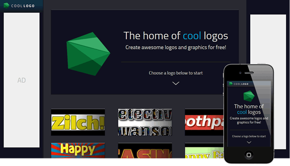
This was a really fun project to work on. My brief was simply to create an alternative interface for the logo generator on FlamingText.com, matching the CoolLogo domain name. While I designed and built the whole site, this post mainly covers the work done on the editor page.
Creating something great
To satisfy the brief I could have just slapped a different skin (CSS) on th site and been done with that, but I wanted so much more. I saw the opportunity to design a modern logo editor, fun and simple to use — things people have come to expect of today's products. I also wanted to live up to the expectation of the domain name and create something that was truly cool.
More than anything I wanted to create something unique and memorable, that people would come back to use again and again. As I found in this project, 3D effects and the unexpected UI joy they can bring can really help to this effect.

Simple & clean
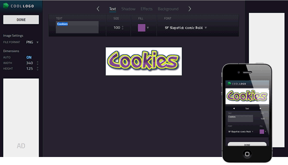
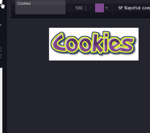
The API from FlamingText for modifying these logos contains of over a hundred different parameters. I didn't want to bring this complexity to the users. I wanted UI that looked simple, that anyone could use. I wanted big hit targets. In order to get what I wanted I dropped a lot of the parameters from the UI, I used progressive disclosure for hiding everything not needed at the moment, and I designed custom UI components that were very space efficient.
Number adjusment
One custom UI component I created was the number adjustment. I wanted something as easy to use as a slider, but something that didn't take up that much space. I also wanted to allow for users to enter exact input via a keyboard, however I wanted the dragging interaction to be emphasized. With inspiration taken from Bret Victor's Tangle JS's drag input intreraction, I did some early experiments over a weekend.
My early user tests showed that users were confused about the double input modes, mainly because they were at times accidentally activated, without the user understanding what was happening.
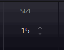
My solution was to more clearly separate the two modes. The main change was to indicate with the cursor when you go into text input mode (by clicking on the number, or tabbing). On mobile the keyboard comes up, so it's not needed. When in the text input mode, I also disabled the normal drag-to-adjust, so you can instead easily drag to select the text. After these changes, the interaction problems disappeared in my user tests.
Cool & Fun
While working on the interactions and hierarchy of the UI, I started experimenting with CSS animations and transitions in order to make it cool. While I wanted effects that were cool and memorable I had to be careful in how I used them — I didn't want the effects to be too splashy and shy away a general audience, and the effects also had to stand the test of time and not grow old and annoying with regular usage.
First impressions
The first question I settled on was how to make the tabbed interface, that I had decided for the main logo settings, cool. The solution came to me after a day of throwing ideas around, as I was going to sleep — spread the tab contents out in 3D space as if they were sides of a cube, and then rotate the cube around to show different settings (the "cube" is technically a rectangular prism). For a while I wondered whether I was only excited about this idea because I knew I would be able to implement it using only CSS, but when I started testing and many users seemed wowed and even refreshed the page a couple of times to see the initial 3D spin again, I knew I had hit gold.
The initial spin of the cube that I made was not there just to look cool. As a general practice I always try, if possible, to distract the users while my interfaces load, as it reduces the perceived load time. The 3D cube took the lead in doing that for CoolLogo.
Originally I had one more reason for the spin — to subtly show the user that there was more in the interface than the first side of the cube shows. I introduced this as a response to my first user tests that showed that the users could not find how to turn the cube, or even the fact that this was possible at all. I had forgone the familiarity of the standard tabbed interface, and users were confused.
The main reason for these problems were because I was trying to get away with not showing the titles for the inactive cube sides in the interface — but instead only showing previous/next arrows, in an attempt to further declutter the interface. In the end it was obvious to me that the titles had to be there.
Leaving on a good note
If the cube had wowed our users in their first impression, I wanted to reinforce that feeling as they we're leaving. This was especially important if we were going to get users to share the site with others, so I gave our share buttons some special treatment (The flip in effect currently looks different in Chrome, due to 3D rendering differences).
More CSS transitions
Keeping it intuitive
On a final note, I spent a lot of time in this project working with and around limitations in the API we use for creating the actual logo images. The most annoying example is with logo size: previously you could not increase it other than by increasing the font size — but then you had to as a next step manually increase outline and shadow sizes etc by the same factor if you wanted the logo to continue to look the same — a very tedious process. I initiated and helped rewriting the api so that we could take care of things like these automatically.
For what we couldn't change in the API, I wrote layers on top in JavaScript that did what I wanted. As an example, I calculate how large sunburst backgrounds have to be in order to fill the image completely, so the user don't have to worry about that. Once again, previously you had to manually increase the sunburst size when the image grew larger than the sunburst.
The always wise Seth Godin once wrote something that comes to my mind here (can't find the link right now). Users come to your product with an expectation of that things should work (and work well). Every time they you do something like the two things I just mentioned you break that promise. Break it once and the user thinks less of your product, break it several times and your users will be looking for competitors to do their business with instead.
It's amazing what we can do on the web these days. I learnt a lot in this project, and I hope that you found this case study useful! I you haven't checked it out live yet, go and play with it for just one minute! As always, if you have any questions or just want to get in touch, please contact me.