
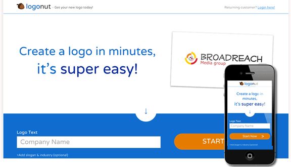
LogoNut home page
In this FlamingText project I was asked to design and build a business logo making website. The proposal was not to break new barriers and create something overly new and unique, but rather to in a cost-efficient way make ourselves visible in this space, as we already had all the technology needed. We wanted to try it out before commiting too much.
The original project name was SVGLogos, for which I did the original design. Later we decided that the SVG term was too technical for our target audience, and we instead went with LogoNut as the project name.
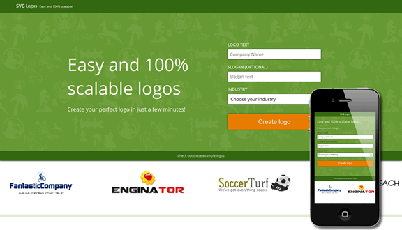
The original design
An ordinary logo maker
The website architechture followed the prototypical online logo maker: a front page, a logo style selecting page, a customization page, and then finally, a page to convince the users to buy the logo they had made. Quite importantly, there's also a large progress indicator at the top of the page, showing the user how few steps they have to take to finish the logo. While a prototypical site structure means increased familiarity for our users from the offset, there were a few things I focused on to set us apart from the competition.
Better logo defaults
The thing I thought that most other logo makers were messing up was that they give users more or less a blank canvas, and then leave it up to the user to create a good logo. Even the sites that give users default logo compositions don't do a overly good job at it, so in this I saw an opportunity for us to do better.
After spending lots of time selecting a good set of logo fonts and symbols, and coming up with the heuristics for the logo layouts, our logo defaults started to look quite good. Now, before the user has given us any information we can't tailor the logo to them, but at least we can inspire them. I do think we do a better job than giving them a blank canvas. This has been partially confirmed since we launched, as we see very few logos made with manual layout alterations.
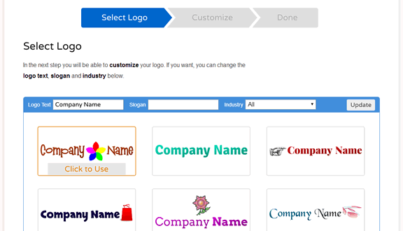
Choose a logo - they're all prepared for you
A note on infinite scrolling vs pagination
For the logo selecting page, my original design made use of infinite scrolling, as I wanted to show off that we had an unlimited number of logos to select from. My user testing showed however that users were reluctant to click on anything, saying that they wanted to reach the end first. Infinite scrolling removes all landmarks in a list, and leaves users feeling like they have less control.
As a solution I settled for a kind of hybrid between pagination and infinite scrolling — trying to combine the best parts of each. The list is now split up into pages, but each page still has quite a long (part of the) list, in order to keep the sense of endless inspiration. To give the user more control I added a 'Load more logos' button at the end of each page.
One thing that is not handled well in this pattern is that if you ever navigate back to this page, you have to start over from the beggining of the list. Although going back to this page is a not a common flow for our users, ideally we would reopen the list at the very point the user were at when they last left the page.
Supporting more browsers and devices
I build modern websites, based on solid best pracice front end development principles, such as progressive enhancement and responsive design. Sometimes that's enough to set you apart from the competition.
Most other logomakers have yet to provide a decent experience for mobile users, and many even utilize flash, making them completely inaccessible from almost all mobile devices. As much as mobile users don't yet spend as much money in e-commerce as desktop users, times are changing.
LogoNut generally works the same on desktops and mobiles, however we do serve a simplified customization editor to mobiles, where you cannot adjust the logo by dragging parts of it around. This simplified editor is also served to older browsers, such as IE7.
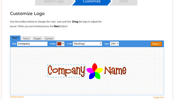
The default editor
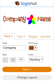
Fallback editor, used for mobiles and old browsers
Performance
The final edge the LogoNut site has over its competitors is better performance. Thanks to the attention I paid to the critical rendering path, the number of requests made, and just keeping the page weight low, the page both starts to render and finishes loading in about half the time for LogoNut as for most if its competitors. In addition I use CSS as much as possible instead of images, for example for the top progress bar, which is made using only CSS.
That wraps up this case study. If you want to see the full site, you can check it out here. I you have any comments or want to get in touch, please contact me.